G
Guest
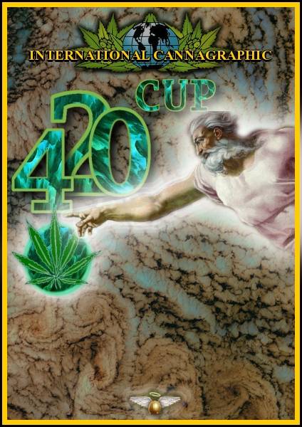
Very original, I like the direction. Those leaves were a good addition!


Thanks, I just wanted to make sure everybody will understand whom the Cup is dedicated to... and the leaves help to define the target :wink:Very original, I like the direction. Those leaves were a good addition!
Grazie Blue.Very nice Fozzolo!

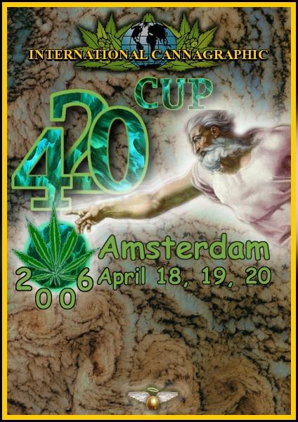
 Can you show how it looks with the leaf in 'green' instead of blue, as well as the 420 Cup lettering?
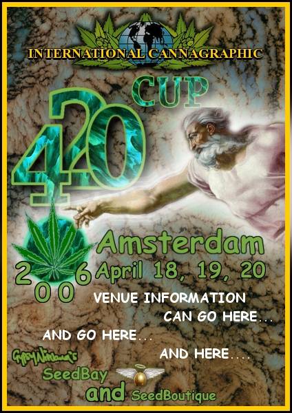
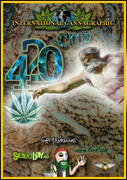
  Like to see how it would look that way also. Also, yeah the Seedbay Gypsy pirate is awesome, but just not sure if it creates a bit of a clash with the almighty one...lol...maybe takes away from the concept, not sure how to describe it, just not sure if it 'fits' the theme. Maybe when you show us the green modification we could also see how it looks with and without the pirate?
 But we don't list entrants on the poster, just the sponsors, which is IC Mag, Seedbay and Seedboutique. Text is easy to change or modify, so no worries, nice design! Kinda reminds me of a 'Time' magazine cover!
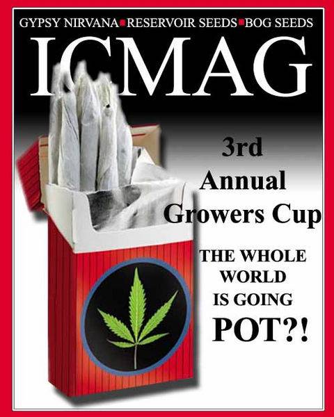
I really like this overall concept - Next Mag cover?Cannabisourus said:

 Anyways, choosing the font is always the hardest part but I'm a bit partial to this one in particular. Call it my lucky font :wink: