Cannabisourus
Member
Blatant
Blatant
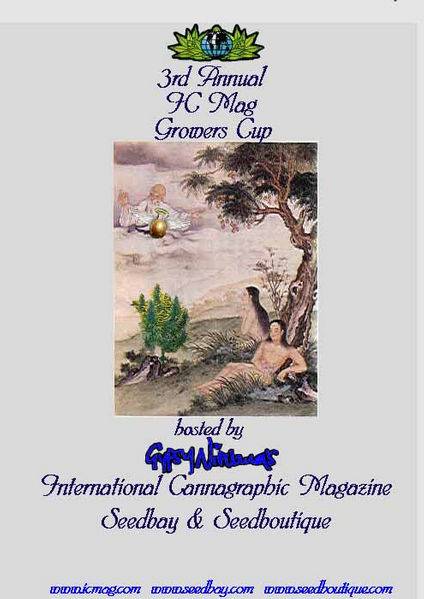
I'm running Linux here (since I'm poor and need something more stable and secure than windows) so I'm pretty darn limited on fonts and graphics work. That's why I used a satellite image of the ocean sea floor to create the marble effect Furthermore, I hate Helvetica with a passion. I hate it's arrogant decietful ways and it's smug attitude. Comic Sans is totally sweet and kicks some major ass; plus it's a free font. Which is good. I do have Impact, but it's just Helvetica in disquise. See the decietfulness I was talking about? Impact is swine. And it's mother. If I were a font, I'd knock its teeth out with my foot out of spite for trying to be different. If I were a font I'd be an extreme font with an attitude, and I'd go around kicking all of the other fonts asses everyday just for the hell of it. People would be like "Where's all my other fonts at?" They're duct taped to a chair in my basement, that's where. Don't mind the sound of the chainsaw running. They're only screaming because they're having so much fun. Silly fonts, keep it down in there.

Blatant
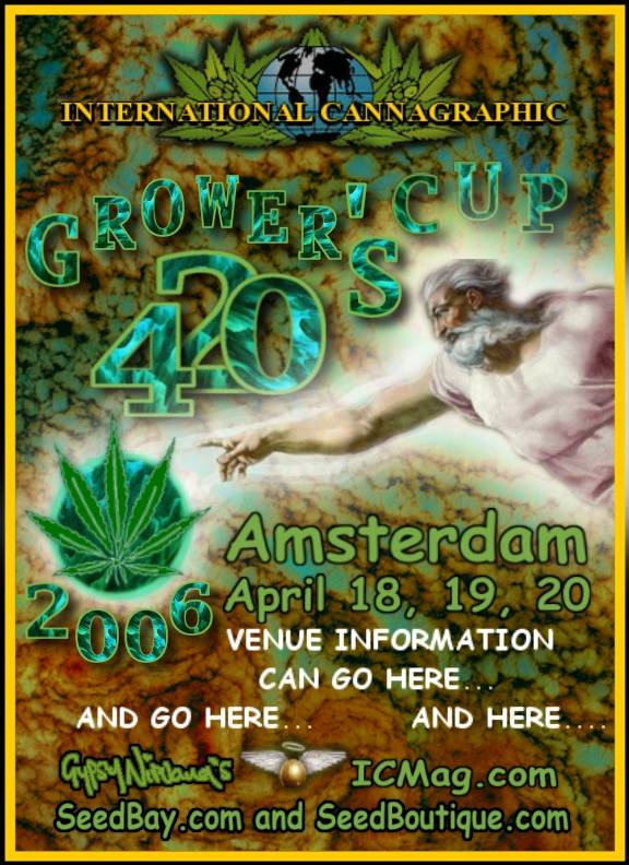
I'm running Linux here (since I'm poor and need something more stable and secure than windows) so I'm pretty darn limited on fonts and graphics work. That's why I used a satellite image of the ocean sea floor to create the marble effect
Furthermore, I hate Helvetica with a passion. I hate it's arrogant decietful ways and it's smug attitude. Comic Sans is totally sweet and kicks some major ass; plus it's a free font. Which is good. I do have Impact, but it's just Helvetica in disquise. See the decietfulness I was talking about? Impact is swine. And it's mother. If I were a font, I'd knock its teeth out with my foot out of spite for trying to be different. If I were a font I'd be an extreme font with an attitude, and I'd go around kicking all of the other fonts asses everyday just for the hell of it. People would be like "Where's all my other fonts at?" They're duct taped to a chair in my basement, that's where. Don't mind the sound of the chainsaw running. They're only screaming because they're having so much fun. Silly fonts, keep it down in there.
 Damn you fonts! I have about 50,000 fonts (no joke) and I think about 20,000 look exactly alike.
")