What's new
  • Happy Birthday ICMag! Been 20 years since Gypsy Nirvana created the forum! We are celebrating with a 4/20 Giveaway and by launching a new Patreon tier called "420club". You can read more here.
  • Important notice: ICMag's T.O.U. has been updated. Please review it here. For your convenience, it is also available in the main forum menu, under 'Quick Links"!

CAN YOU HELP TEST NEW SEEDBOUTIQUE?

Gypsy Nirvana

Recalcitrant Reprobate -
Administrator
Veteran
Hello ICM members and guests...

The 'Techie's' and 'Boffin's' have come up with a new and improved Seedboutique web-site....but before we let it fly on the net it needs testing...so here is a little message from them regarding this:

"Hello ICMAG, it's with great pleasure that I announce the launch of BETA testing for the Seed Boutique site.

We've just about finished the new site and before we put it up on our servers, we need to work out the bugs and kinks. With that said, there is a bare version of the site on a dummy server, and we would like as many ICMAG users as possible to have a look, play around with it, test it out and report your feedback here in this thread.

Any feedback is welcome, you are free to say whatever you like about the site, including criticism. It will help us work out some of the bugs. Please note that the BETA testing site DOES NOT contain any customer information. It's plugged into a dummy server and a dummy database that is empty and to be used just for testing.

Upon completion of the BETA test, that dummy server and database will be erased and the real site will be uploaded onto our bullet proof servers in Holland. Also, please note that NO ORDERS will be processed.

You can browse the site, add to basket and checkout, but none of the financial modules (such as credit card processing) are plugged in right now. You can order £10 million worth of seed if you like, unfortunately it won't get processed and sent out :) We hope you like the new site, we believe it's considerably more secure, cleaner, faster and has a far better, modern, simple, yet elegant design. The site has all kinds of new features like our FAQ section, help desk and news stream.

We are also now connected to twitter, and will be sending out 'tweets' in the future to alert customers of new strains, promo's etc. We hope you enjoy the site and look forward to your feedback!

- John Bourne & ICM WEB-BOD (the tech guys)"

*So if you have the time and inclination, help us out and check it out....

** and here is the link:

***PLEASE NOTE THE CURRENCY CONVERSION FUNCTION WILL NOT BE POSTED FOR TESTING PURPOSES, BUT IT WILL BE AVAILABLE ON THE FINISHED VERSION OF THE SITE

**** PLEASE NOTE WE HAVE SHUT DOWN BETA TESTING, THE FEEDBACK WE HAVE GOTTEN FROM ICMAG USERS HAS BEEN FANTASTIC. WE'VE COMPILED A LIST OF BUGS, GLITCHES AND KINKS AND WILL BE WORKING HARD TO RESOLVE ALL THESE ISSUES IN THE NEXT LITTLE WHILE BEFORE WE FINALLY LAUNCH THE NEW BOO SITE. WE WOULD LIKE TO TAKE THIS OPPORTUNITY TO THANK ALL OF YOU FOR YOUR HELP AND EXCELLENT INPUT. THANK YOU!!!****
 
Last edited by a moderator:

funkervogt

donut engineer
Veteran
First impression: I dig the new Bou! This is a fantastic update and brings it more along the lines of the Bay in terms of design. I'm also happy to see that you took a somewhat minimalist approach to the design of this and did not bog it down with unnecessary imagery.

Some comments:

- The main nav is enormous. This is probably something you could showcase on the home page and shrink on the inside pages. On the home page I want to survey the site, and this gives me a good idea of what's inside and how to get there. But once I'm on the inside pages and familiar with the metaphor I don't need the imagery that prominent.

- Where do I change the currency? It only lists GBP.

- Along these same lines, I only see a few countries listed on checkout (UK, Aruba, a few other A's). I'm guessing this is because it is pre-launch and the full list has not been created yet, but as a US customer a tremendous amount of fear and loathing crept through me.

- The login box at the left feels ominous. I realize you had to login with the current Bou to place an order, but we didn't get exposed to that until the end. I'm happy to see you can view details of seeds without the necessity to login.

EDIT: - The FAQ page is a bit weird. What's with the FAQ image? Is it necessary? Why accordion the sections if there's so few options? I'd rather have the FAQ exposed without the accordion effect and no weird image at the left taking up screen realestate. The privacy policy has the opposite problem, with the information too unabstracted (but still has the weird long presence image). There's a balance between too much information and too little.

EDIT AGAIN - On the seed list there is a huge amount of whitespace between categories with no seed vendors. If "E" does not have anything under it, why give it this much realestate? These could be compressed or removed altogether if there's nothing under them.

EDIT ONCE AGAIN - Why only 8 selections listed under a seed vendor's page? No need to paginate to that few - you could bump it up to 20 selections per page and make me a very happy user.

- Recent News moves too fast for it to be meaningful to me. It ends up getting lost in the noise. One or two static briefs here instead of several scrolling ones is better, imho.

These are all quick hits. Now for longer-term thing that has bugged me for a while:

- The one thing that a certain other site which will not be mentioned does really well, even if it doesn't really work, is allow me to surf the catalog by desired strain characteristics. On the Seedbou website I get the overview on the index page but I have no ability to scour the site by Sativa, Indica, flowering time, effects, etc. etc. The first time I visited the Bou (then SD) I was inundated with options. I had no way of narrowing down a selection by these aforementioned criteria. Check out how Zappos does this - I want some new kicks, and have a general idea in mind, and they help me through the process by giving me options on style, price, color, fit, etc. etc.
 
Last edited:

oldpink

Un - Retired,
Administrator
Veteran
- Where do I change the currency? It only lists GBP.

- Along these same lines, I only see a few countries listed on checkout (UK, Aruba, a few other A's). I'm guessing this is because it is pre-launch and the full list has not been created yet, but as a US customer a tremendous amount of fear and loathing crept through me.


EDIT AGAIN - On the seed list there is a huge amount of whitespace between categories with no seed vendors. If "E" does not have anything under it, why give it this much realestate? These could be compressed or removed altogether if there's nothing under them.

EDIT ONCE AGAIN - Why only 8 selections listed under a seed vendor's page? No need to paginate to that few - you could bump it up to 20 selections per page and make me a very happy user.

Currency & country options will be added before we go live

there are more than 8 strains you should have page numbers to navigate to the other strains
 
M

mugenbao

Overall I really like it. Easy to navigate, easy to search, pretty snappy for being on a sandbox server. It's obviously still got a little ways to go before being ready for prime time, but the overall user experience is much nicer than the production SeedBoutique site.

I didn't get much chance to do a lot of testing since I gotta start work, but these are the things that stuck out at me after about 20 minutes of poking:

Overall


  • Consider using a CDN for images (signup.jpg takes quite long, many other images slow)
  • 404 for ddlevelsmenu-base.css
  • 404 for wysiwyg.js
  • No obvious way to change currency type (USD, CDN, etc)
  • Consider using autocomplete for search (JQuery autocomplete already pulled in by the page)
  • RSS feed link redirects to main page. Would be nice to at least have a dummy feed to validate structure

Sign-Up

  • Dropdown/combo controls are not intuitive. No apparent hotkey to trigger dropdown, no autocomplete.
  • No State selection
  • No link to Terms and Conditions on form, should be near "I Accept" checkbox
  • Password field unnecessarily short (encourages poor passwords)
 

oldpink

Un - Retired,
Administrator
Veteran
The FAQ page is a bit weird. What's with the FAQ image? Is it necessary? Why accordion the sections if there's so few options? I'd rather have the FAQ exposed without the accordion effect and no weird image at the left taking up screen realestate. The privacy policy has the opposite problem, with the information too unabstracted (but still has the weird long presence image). There's a balance between too much information and too little.

the FAQ is nested so people can see what info they want without having to scroll down half a page
looking for the info they need, theres too many questions to have them all laid out on one page

as for the privacy statement it is one document so has to be on the one page
the images are personal preference and reflect where you are on the site
 

gdtrfb

have you seen my lighter?
ICMag Donor
Veteran
Search Results for : haze
<< >>
No Product Found..

just on general principle, i'm gonna have to call foul on that one ;)

there's some layout wonkiness i'm sure will figure itself out (the 'secure website' thing overlapping your banner - trivial stuff like that) but overall, i like it.

i'd buy seeds if it was a list scrawled on butcher paper with lipstick, too, tho.
 

SumDumGuy

"easy growing type"
Veteran
I just finished navigating through the site. No kinks, glitches or any issues whatsoever on my end. Other then the currency exchange which was previously answered - you guys are batting 100/100!! :)

Btw.. I LOVE THE NEW SITE!!!
 

b8man

Well-known member
Veteran
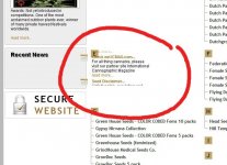
A gnat shaped bug: On Chrome the Recent News box is scrolling too far to the right of the area it's meant to be scrolling in, so that it's overlapping the main text.

And yeah, that banner thing with the secure login.


IMHO, the site looks a bit generic now. Reminds me of Attitude's site.
 

chidoctor

Member
hey OP i see some strains that are listed (rare)does that mean that they will be up for sale? i agree with other comments that everything comes off enormous. rather easy to navigate and the few bugs will be corrected im sure
 

dusto2k3

Member
i get weird text scrolling vertically over the pic of the ak-47. Using Chrome. Year, its too far over to the right,-

with firefox, the recent news worked just dandy.
 
Last edited:

Panama Red

Active member
Nice look.

Seems to work well in Firefox and Opera.

I found a glitch in Chrome.

Seems like your scrolling "Recent News" loses it's anchor.

Bou.jpg

.
 

ibjamming

Active member
Veteran
1. register - postcode is usually after the city.

2. Says registered...with a popup...but takes you back to blank sign up form. It's better to take them to home...or somewhere else.

3. Home page - no way to change currency.

4. Home page - how about listing the seed companies down the side...like that "other" seed seller?

5. No United States delivery? I don't see it listed in delivery address country.

6. Again...how much IS 323.80 pounds?

7. Post code in RED at confirn order...hmmm...

8. A thank you for your order page shows briefly with gibberish...like reading a manual written by the Chinese.

Love the new look...
 

Ribsauce

Active member
was just playing with the site for a while and im definitely digging it...i had a few questions at first but they have already been previously stated... i cant wait to give the new site a go for real :joint:... thanks sbay and sbou cats for keeping the scene alive haha
 

sanjuan

Member
The curser blinks annoyingly fast in the login and search fields.
Goes the right speed when I hover "Recent News"; this is on IE8.

Most shopping carts allow quantities to be changed and updated, not just deleted.

Sativa Seedbank isn't there--just Nirvana.

I assume the live version will use https for the credit card entry.
 

mooch755

Idle hands are the devil's dingaling!
ICMag Donor
If i select Order Quantity :5 Add to basket i see at the top of
the page Shopping Basket Items - 5 Amount - £319.75

if i then select the Checkout button just above the
"Add to Basket" "Reviews" buttons my order changes to
Shopping Basket Items - 1 Amount - £67.95
with a Sub Total of: £67.95

the order quantity of 5 is gone.

hope this makes sense..

-mooch
 
J

John Bourne

If i select Order Quantity :5 Add to basket i see at the top of
the page Shopping Basket Items - 5 Amount - £319.75

if i then select the Checkout button just above the
"Add to Basket" "Reviews" buttons my order changes to
Shopping Basket Items - 1 Amount - £67.95
with a Sub Total of: £67.95

the order quantity of 5 is gone.

hope this makes sense..

-mooch

great find mooch...if you click the checkout button at the top right of the page, it works correctly. if you click the one on the product page, it's faulty and doesn't compute the previous basket items. big help! thanks.
 

Latest posts

Latest posts

Top