What's new
  • Happy Birthday ICMag! Been 20 years since Gypsy Nirvana created the forum! We are celebrating with a 4/20 Giveaway and by launching a new Patreon tier called "420club". You can read more here.
  • Important notice: ICMag's T.O.U. has been updated. Please review it here. For your convenience, it is also available in the main forum menu, under 'Quick Links"!

Have you looked at the North Pole lately?

kmk420kali

Freedom Fighter
Veteran
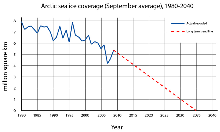
It's some sort of ice mass unit such as square miles...

The point is, IT WILL BE GONE IN LESS THAN 25 YEARS.

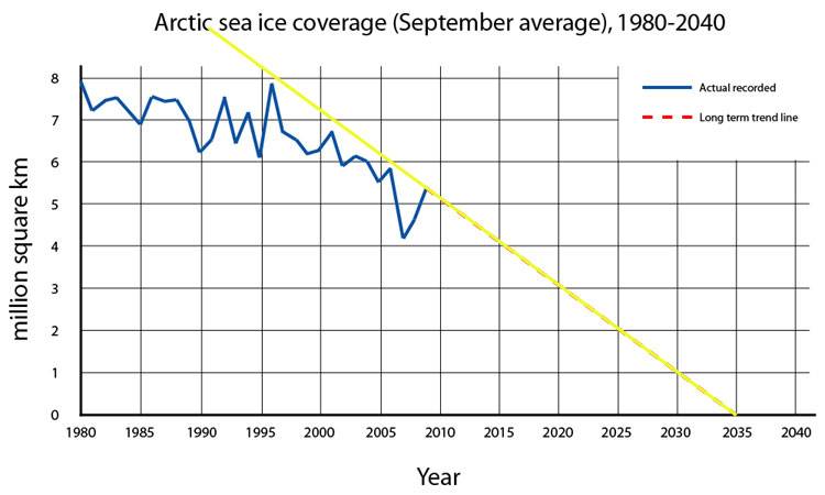
Here is a better graph, there is tons of info out there.

arctic-sea-ice-future-coverage-2035.jpg

So if we are in the heart of Global Warming...why does that chart show the biggest rise since 1995?? The dotted line is just a guess, right??:tiphat:
 
T

thesloppy

Yeah, I'm no denier, but that is one crappy graph. If you extended the 'trend' line backwards it might touch another point on the 'recorded' line....that's not so much of a trend.
 
T

thesloppy

Those ups and downs aren't seasonal, there's 5 years between 1995 and 2000 , with a single peak and a single valley (let alone it kinda says 'September average' in really big, bold letters up there). Likewise, that trend line isn't curved to present a lowering trend, it's just a straight line that touches the record on a single point:

arcticice.jpg


Additionally, even if the trend were trending in that direction, at that rate, it wouldn't intersect with the 'recorded' graph at the point of the most recent record. I would be very skeptical of where/whomever that graph came from, regardless of your stance on the issue.
 

DiscoBiscuit

weed fiend
Veteran
I not referring from winter to spring to summer, etc. I'm talking about the marginal ups and downs that (overall) trend lower. Doesn't have to be a consistent line to plot a trend.

What the straight line predicts is the marginal highs within the overall lowering trend. There's statistical data that represents the blue line and the yellow is projection. It's not really necessary to determine future peaks and valleys when it's gonna be gone before 2050.
 
G

greenmatter

I think the north pole is rich in diamonds too, the melting ice just makes all the good stuff easier to get to.

therefor melting ice is a sign that mother nature may not be sitting comfortably for the next few years:tiphat:
 

DiscoBiscuit

weed fiend
Veteran
...Additionally, even if the trend were trending in that direction, at that rate, it wouldn't intersect with the 'recorded' graph at the point of the most recent record. I would be very skeptical of where/whomever that graph came from, regardless of your stance on the issue.

I'm not banking on it but science is pretty versed in climate measurement these days. There's nothing in satellite photos that prove otherwise. Alex Jones tries to say that satellite images prove the ice comes back in the winter but scientists say it only get thinner until (sooner than later) we'll have no ice in the summer.
 

303hydro

senior primate of the 303 cornbread mafia
Veteran
Those ups and downs aren't seasonal, there's 5 years between 1995 and 2000 , with a single peak and a single valley (let alone it kinda says 'September average' in really big, bold letters up there). Likewise, that trend line isn't curved to present a lowering trend, it's just a straight line that touches the record on a single point:

arcticice.jpg


Additionally, even if the trend were trending in that direction, at that rate, it wouldn't intersect with the 'recorded' graph at the point of the most recent record. I would be very skeptical of where/whomever that graph came from, regardless of your stance on the issue.

I don't think you are reading a graph right.
Here are 6 different analysis .... see a trend?


SOURCE: meted.ucar.edu

images
 
Those ups and downs aren't seasonal, there's 5 years between 1995 and 2000 , with a single peak and a single valley (let alone it kinda says 'September average' in really big, bold letters up there). Likewise, that trend line isn't curved to present a lowering trend, it's just a straight line that touches the record on a single point:

arcticice.jpg


Additionally, even if the trend were trending in that direction, at that rate, it wouldn't intersect with the 'recorded' graph at the point of the most recent record. I would be very skeptical of where/whomever that graph came from, regardless of your stance on the issue.
IDK who put this out but that yellow trend-line is dishonest as hell. Why not start the fucking line at the beginning? Oh I KNOW WHY! B/c it wouldn't support your agenda as clearly. Why do ppl do this shit? Intellectual dishonesty at it's best.

I have no idea where it came from but wherever it did you can pretty much discredit the rest of their shit as spin too with such a blatant misrep like that.

Edit: Fun fact. The earth is 6 billion or so years old. The North Pole isn't nowhere close to that old. That means the NP ice has melted completely and came right back all before humans were remotely capable of affecting it.
 

DiscoBiscuit

weed fiend
Veteran
Dismissing a scientific calculation with no science just wastes the space it took to type your comment.

Dinosaurs might have lived millions of years but it was only in the confines of an environment that supported them. Humans are a relative blink of an eye compared to the hundreds of millions of years of complex life on earth. You can't possibly suggest wholesale pre-history as habitable for humans.
 

StealthDragon

Recovering UO addict.
Veteran
After very careful scientifical analysis and mathematical formulatin' I've decided that this graph perfectly supports the 2012 scenario as well as many others...maybe everyone is right? :hide:


maybe I should have used a scarier color then pink...just pretend it's bloodred highlighted in "deadbody brown"
 

303hydro

senior primate of the 303 cornbread mafia
Veteran
IDK who put this out but that yellow trend-line is dishonest as hell. Why not start the fucking line at the beginning? Oh I KNOW WHY! B/c it wouldn't support your agenda as clearly. Why do ppl do this shit? Intellectual dishonesty at it's best.

I have no idea where it came from but wherever it did you can pretty much discredit the rest of their shit as spin too with such a blatant misrep like that.

Edit: Fun fact. The earth is 6 billion or so years old. The North Pole isn't nowhere close to that old. That means the NP ice has melted completely and came right back all before humans were remotely capable of affecting it.


It's idiotic statements like this that now make me understand why these threads get so heated and therefore get deleted.

Any graph is nothing more than a picture of data. The data is factual. The point is that there is becoming less and less ice every year and it is going to hit zero soon if it continues on the course it is currently on. Its called math, it's not really propaganda because none of these scientists are saying WHY it's happening just that it IS HAPPENING.
 
Dismissing a scientific calculation with no science just wastes the space it took to type your comment.

Dinosaurs might have lived millions of years but it was only in the confines of an environment that supported them. Humans are a relative blink of an eye compared to the hundreds of millions of years of complex life on earth. You can't possibly suggest wholesale pre-history as habitable for humans.
And what makes you think the Earth is supposed to stay habitable for humans? Who made that rule?
 
It's idiotic statements like this that now make me understand why these threads get so heated and therefore get deleted.

Any graph is nothing more than a picture of data. The data is factual. The point is that there is becoming less and less ice every year and it is going to hit zero soon if it continues on the course it is currently on. Its called math, it's not really propaganda because none of these scientists are saying WHY it's happening just that it IS HAPPENING.
The line makes the ice appear to disappear at a faster rate than it really is. Why not draw it from the start of the dataset. It still shows the same picture but just not as fast a rate or as alarming of a decline. That's what pisses me off about ppl in either camp on this issue. They all do this to some degree or another.

I'm not for or against GW, shit changes and how much is natural and how much is our own we cannot possibly know. I'm ok with this. Not to say humans can't seriously mess shit up though, Linfen, China is a good example of that.
 

igrowone

Well-known member
Veteran
Well, thread has lasted a day. Longer than I expected.
I guess I don't get too worked with the extreme opinions. We're not going to stop burning fossil fuels in any meaningful way for quite a while.
So I figured I might just as well load up the vape(or bong, etc.), and watch the ice melt.
 

HempKat

Just A Simple Old Dirt Farmer
Veteran
So if we are in the heart of Global Warming...why does that chart show the biggest rise since 1995?? The dotted line is just a guess, right??:tiphat:

Because the impact of global warming isn't a straight line increase or decrease (depending on what's being measured. The impact is most significantly seen in global changes to weather patterns that can cause fluctuations up and down in temps of a given location but with the overall trend being downwards which is exactly what the chart shows.

Keep in mind the likely end result to Global Warming is an Ice Age once enough polar ice melts to dilute the salinity of the oceans which can shut down the Ocean's Thermohaline circulation aka the ocean conveyor belt, the great ocean conveyor, or the global conveyor belt. This is the scenario explored in the film "The Day After Tomorrow."
 

ShroomDr

CartoonHead
Veteran
Once Greenland's ice sheet gains enough lubrication, it will slide into the north atlantic and disrupt the gulf stream. Odds are, this disruption will have major implications on sea life, but on the other hand, the artic ice sheet will come back.

Im pretty sure ive read that when Panama was open water, there was no arctic ice sheet, and when it closed, it caused major oceanic disruptions.

Global warming and climate change are undeniable; its man's impact that seems to be debated.

I for one think mans ability to stop climate change is laughable. Its awfully ostentatious to think we can make an impact. If a volcano or two goes 'Krakatoa' or worse, what will we do about all those greenhouse gases being given off?

The only way we actually stop carbon is eliminating coal, oil, and natural gas. This could only be accomplished with nuclear energy. Most environmentalists dislike nuclear energy, go figure.

FWIW nuclear fusion power plants seem pretty safe.
 

Latest posts

Latest posts

Top